
An article written by Maria Abi-Habib for the Wall Street Journal is making the rounds on social media. It’s entitled “Christians, in an Epochal Shift, Are Leaving the Middle East”. You can read it here.
Now, the article deals with many issues, but its central thesis is essentially summarized in the title.
I won’t criticize that in itself. It’s clear that the percentage of Christians in the Middle East is indeed decreasing. That’s a very obvious conclusion, but how much does it say? Not much.
But I won’t get into that because it requires much more time than I have at the moment. In fact, I am not even going to focus on the article itself because what bothered me the most was this graph.

I think we can all agree that readers tend to remember visuals more than the text itself. A good percentage of the traffic to this article is going to come in this form:
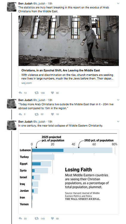
Given today’s context of Islamophobia in the West and the wave of xenophobic populism which uses Middle Eastern Christians to justify their hatred of Muslims, such misleading graphs are reckless at best.
I will focus on two countries that I am familiar with: Palestine and Lebanon.
Palestine
The reader will notice that the graph does not mention Palestine, at all. This may not have been Abi-Habib’s intention, but I doubt that Palestine not being in a Wall Street Journal/Harvard graph is a coincidence.
It does, however, mention Israel. It states that Israel’s Christian population in 1910 was about 8,0% and Israel’s Christian population is projected to be 1,8% in 2025.
The problem with that ‘fact’? Israel did not exist in 1910.
It was founded in 1948 and its founding was only made possible with the Nakba, or ‘Catastrophe’ in Arabic, the name used to describe the forced exodus of 700,000 Palestinians, many of whom were Christians.
Today, there are about 30-50,000 Palestinian Christians living in between Gaza and the West Bank, over 100,000 in Israel Palestine and over 500,000 in the diaspora (from what I know, please correct if wrong). There are more Palestinian Christians in Chile alone than in Palestine.
Palestinian Christians who fled are denied the right of return due to Israel’s apartheid laws. They belong to the wrong religion. Meanwhile, the Israeli government continues to make a profit off of Christian pilgrimage to the holy land and uses its ‘tolerance’ of Christians to sell its brand to the West, especially Americans who comprise the most influential group of Christian Zionists.
Israel refers to its Palestinian Christian population as Arab Christians to differentiate them from Palestinian Christians living in Gaza or the West Bank. This despite most identifying themselves as Palestinian Christians.
To put it differently: Christians are fine, just not the native ones.
Lebanon
The graph states that there were about 80% Christians in Lebanon in 1910 and that it will be about 30% in 2025.
The problem is, again, the date. There was no Lebanon in 1910. There was Christian-majority Mount Lebanon, which is part of modern (post-1946) Lebanon. Mount Lebanon was a Mutasarrifat (one of the Ottoman Empire’s subdivisions) created in 1861 and lasting until 1918.
In 1920, Greater Lebanon was announced under a French mandate. It was called Greater Lebanon because the territory doubled to include Muslim-majority Ottoman districts of Tripoli, Sidon and the Bekaa Valley. Hence why the percentage of Christians decreased – the total population of ‘Lebanon’ became greater.
The subsequent territory would become The Republic of Lebanon in 1946 when it declared independence.
The subsequent exodus would occur during the 1975-1990 Civil War.
The authors of the graph could have made a similar point had they chosen to look at changes in Lebanon between the 1960s and 2010s. It seem to imply that the denominator remained constant – why else would it say ‘plummet’?.
The authors of the graph should make it clear to their readers that the region has seen drastic changes in the past century. I have to admit that the numbers look suspicious in the first place. I’m no expert on demographics, but I’ve read enough books on Lebanese history to know that there is something off about the graph.
The Wall Street Journal should explain to its readers why it erased Palestine and why it used graphs that were, at best, misleading.
